- Product Design
- UX Strategy
- User Research
- May 2016 – Aug 2016
MailChimp is the world’s largest email marketing company, empowering business owners and marketers through data and design. Our mission is to democratize technology for small businesses by offering services like automation, integrations, and customer insights to help our customers reach their audiences and grow their ventures.
I returned back to MailChimp this past summer to design and develop the share module: a feature that helps agencies who run business operations through MailChimp communicate with their clients and coworkers.
The Challenge
Business owners and agencies experience the stress of wearing multiple hats.
Symptoms of Being a Business Owner
In addition to marketing, business owners also need to develop their products, negotiate deals, and collaborate with their employees. This leads to several points:
Users don't have enough time to explore new features. Even if there’s a better way to perform a task in MailChimp, the perceived cost and effort for changing their workflow prevents users from utilizing every feature that's available to them.
Agencies and freelancers often have to manage their clients’ marketing needs. Agencies who use MailChimp to share reports with their clients have expressed difficulties in the collaboration process and have submitted requests for better tools for sharing resources.
Users rely on MailChimp to help them look like pros. A client's experiences with receiving MailChimp information reflects upon both their perception of the platform and their choice in hiring someone to manage their marketing.
Inconsistencies in Sharing
As the MailChimp app grew, features were developed with patterns and components in mind. However, some of the older forms of sharing weren't updated while other features were being developed.
While there are differences between the types of resources that can be shared, there's an inconsistency between each sharing method and how functionally robust and clean they are.
Inconsistencies in Sharing: Audit

Designing a Solution
Prototyping, testing, and iterating upon ways to improve and standardize sharing
Creating a share module that handles each sharable resource in MailChimp helps solve the issues and pain points mentioned above.
From an internal perspective, developing a new component will make future maintenance and feature additions much easier. From an experience design standpoint, it familiarizes our customers with sharing functionalities while making our customers feel confident with MailChimp.
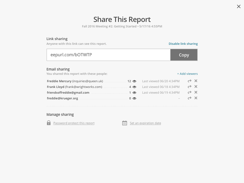
Iteration 1: Modal
Feedback
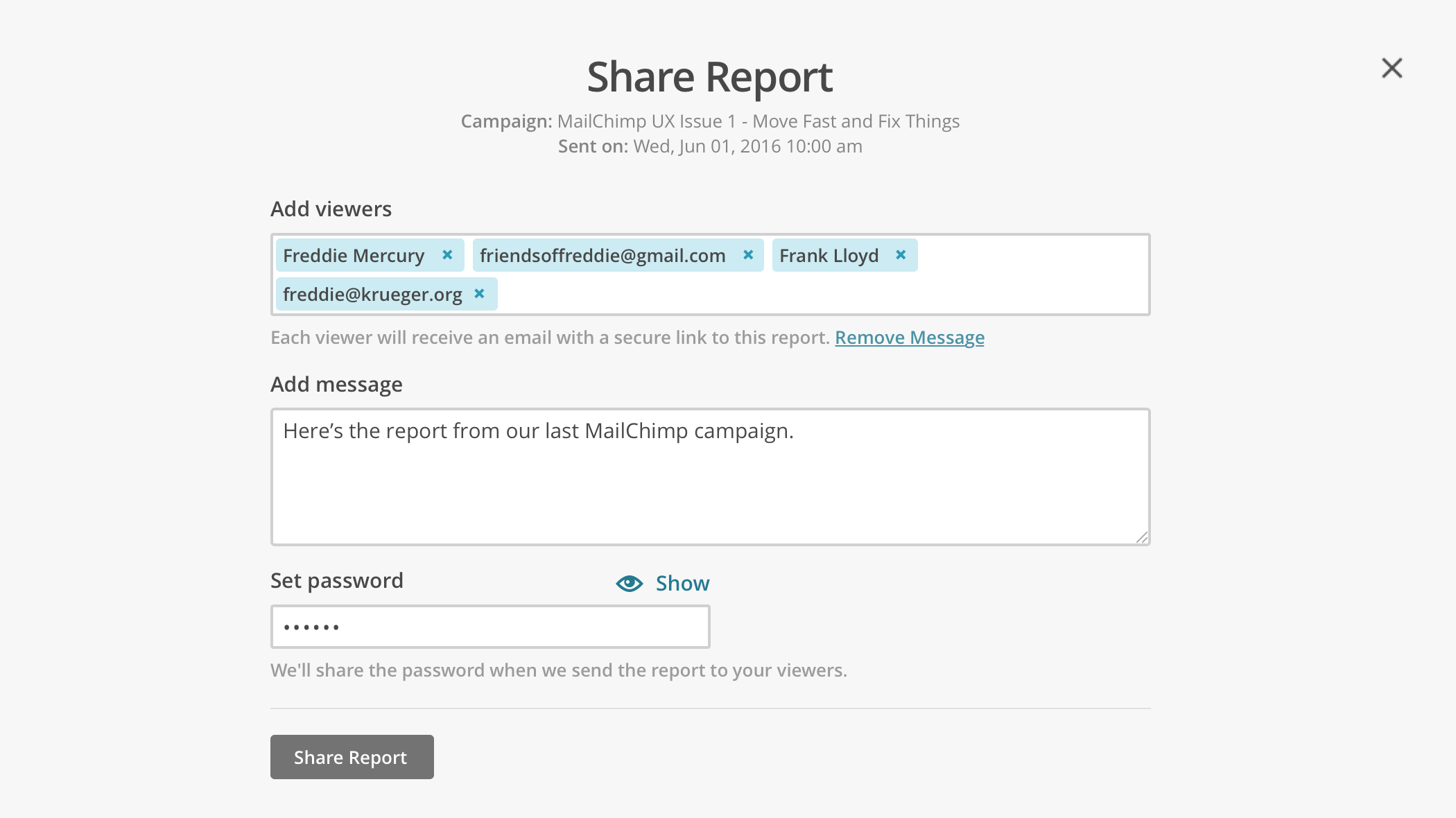
The narrow width of the modal makes the content feel cramped, especially when there's a large number of viewers invited.
What does the "Done" button at the bottom do? It feels confusing when juxtaposed with the email sharing option right above it.
While most modals in MailChimp have a done/confirm/exit button at the bottom, the final action for the share module doesn't entirely make sense.
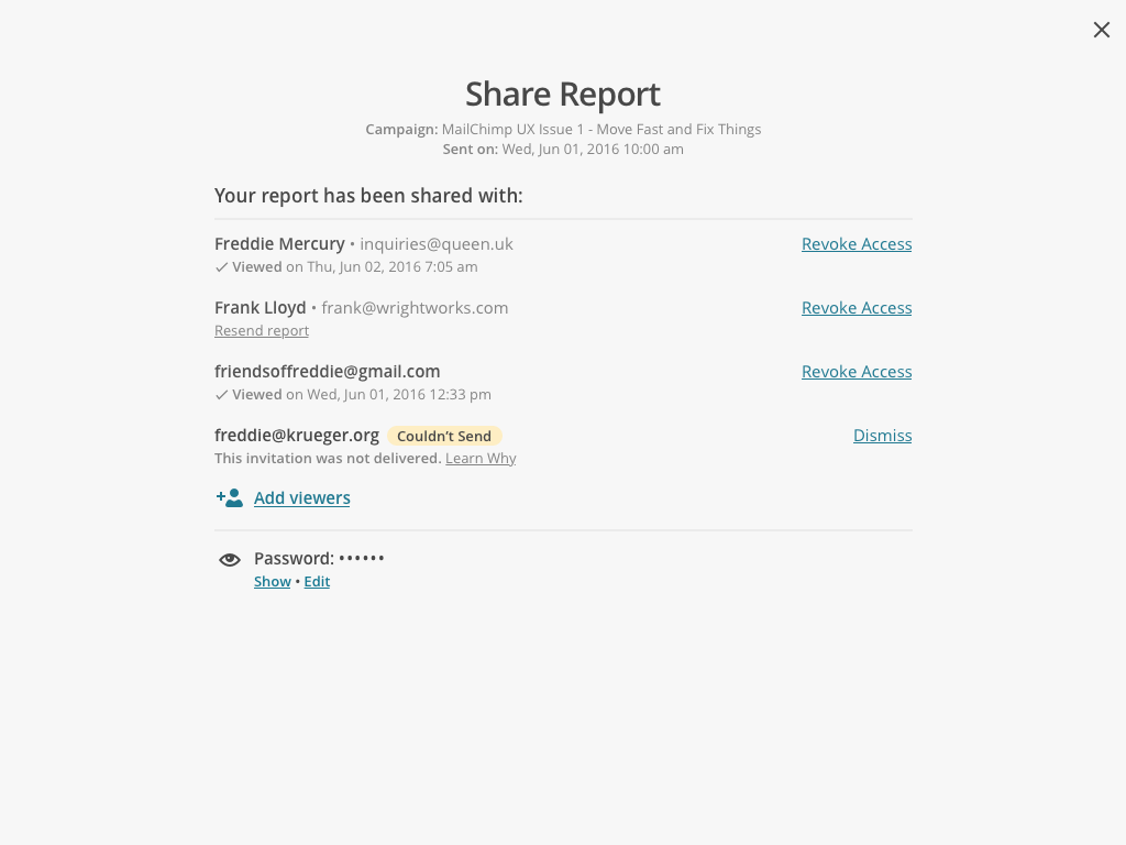
Iteration 2: Overlay
Feedback
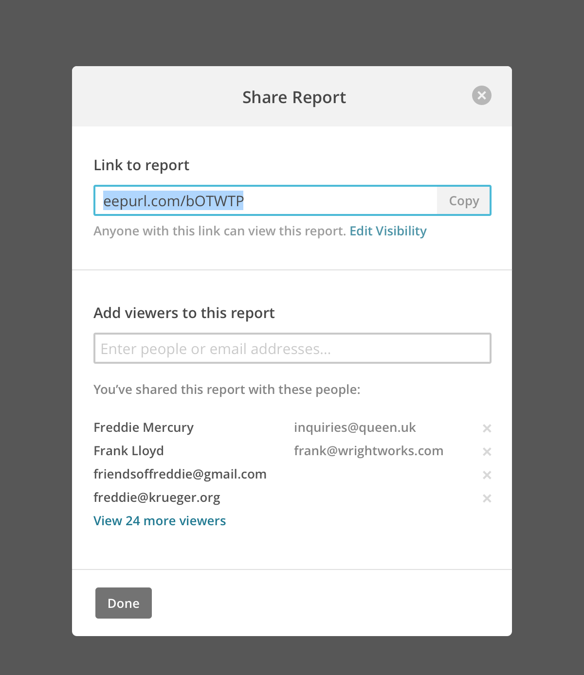
The toggle confused usability testers—does the switch apply to the entire report or just to the link? What does private/enabled mean?
The "Edit visibility" link is not very visible. Users may gloss over those settings or not even realize that they might be useful.
Users who visit the share module a second time will most likely want to manage their viewers, so automatically collapsing the view gets in the user's way.
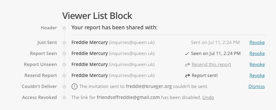
Iteration 3: Improving Managing Viewers
Feedback
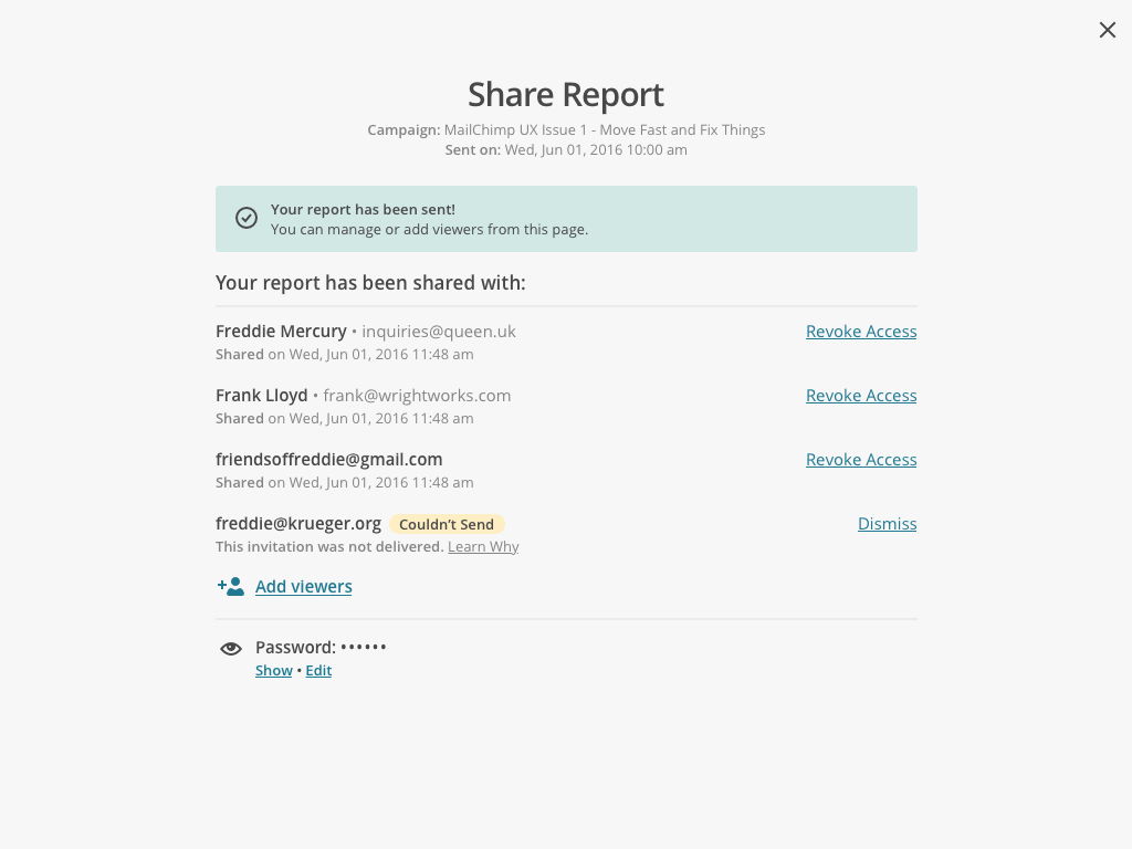
Our developers were able to provide advanced information on a report's viewers, which provides more value and functionality than what already exists.
Some pieces of information like the specific number of opens seemed too granular, and the times/dates opened could use some reformatting.
Usability testers didn't understand what the icons on the right hand side meant.
Iteration 4: Removing Link Sharing
Feedback
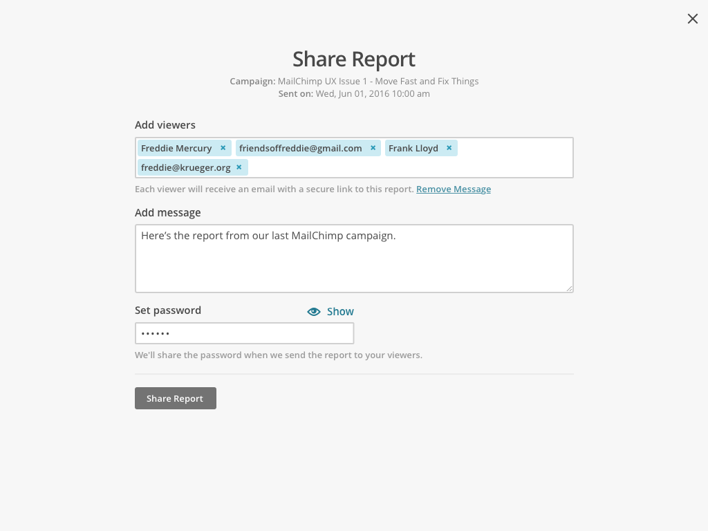
The link sharing option for reports was removed because of security reasons and the potential for accidentally exposing customer data.
The share module now accounts for additional error states, such as an email invitation bouncing.
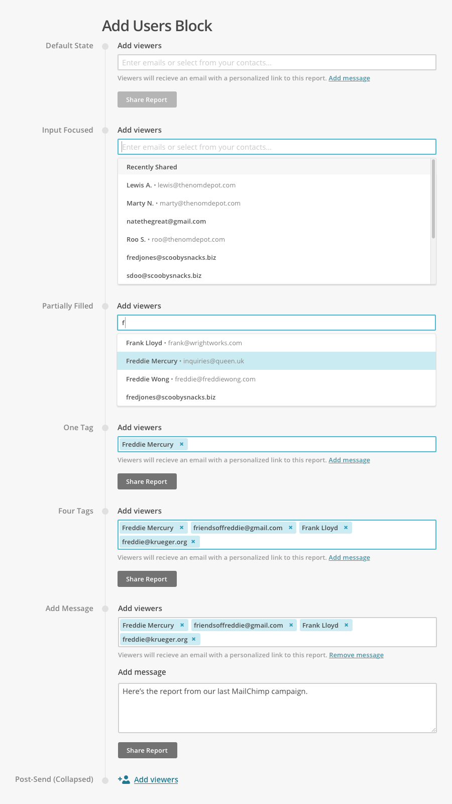
The "Add viewers" block is much easier to locate when it's underneath the list of recipients, implying that more viewers can still be added.
Components, Features, and Measurement
Creating elements and following processes at MailChimp to strengthen our design language
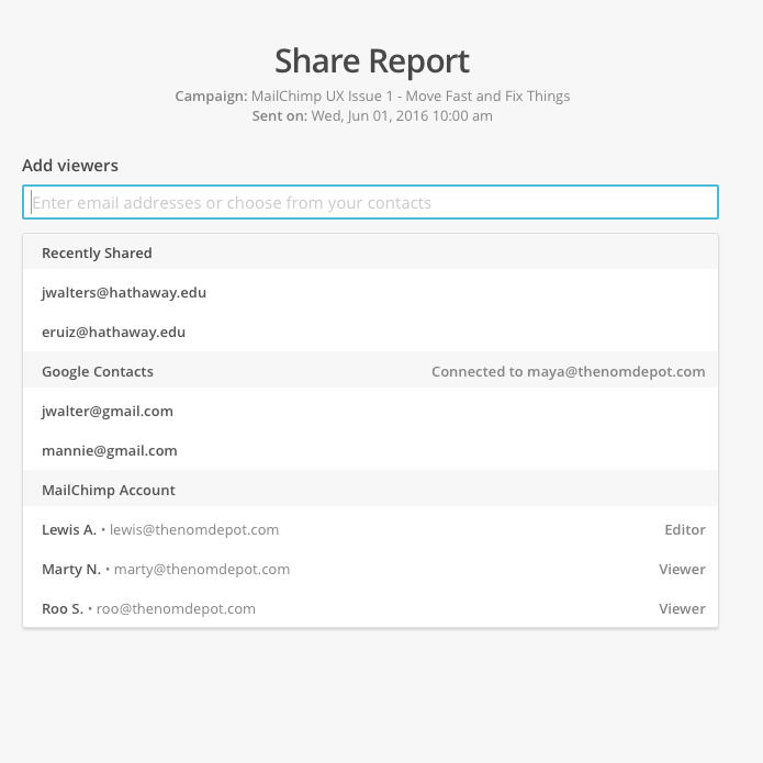
Typeahead Interactions
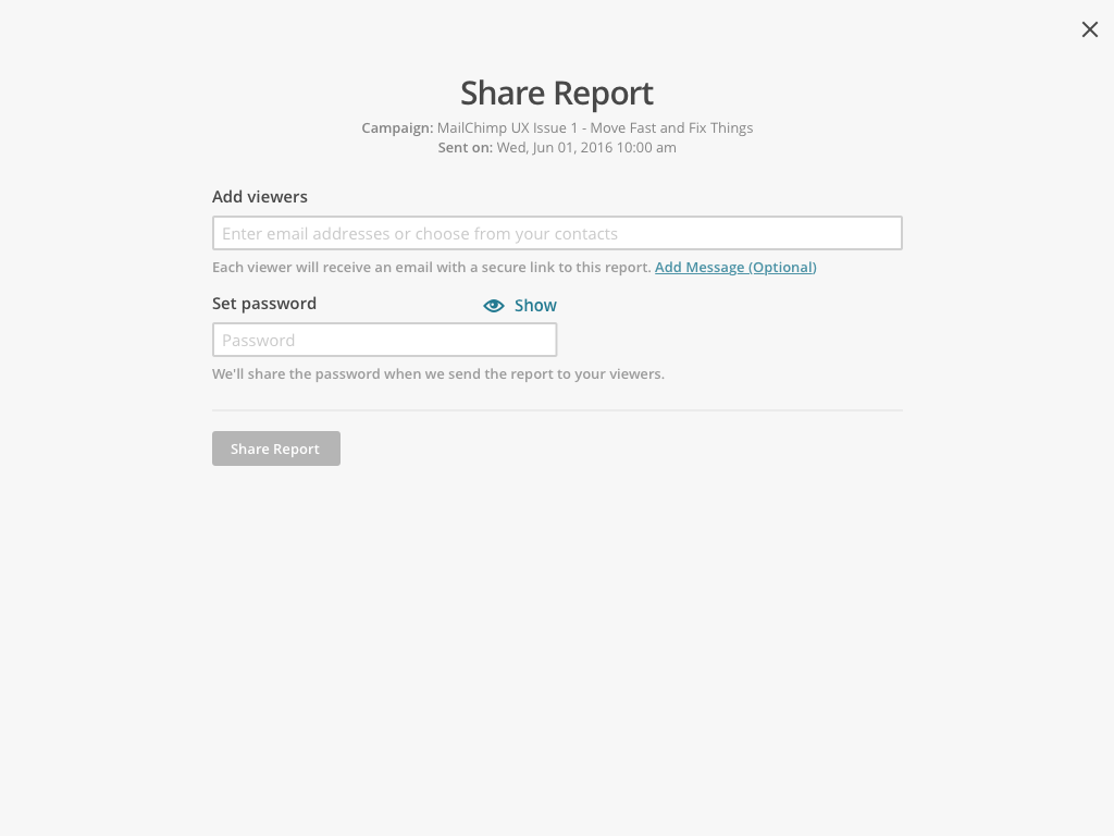
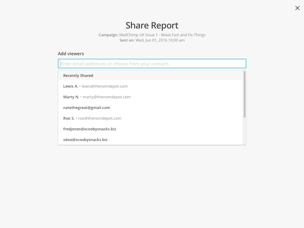
The act of typing in emails is error-prone and repetitive, especially for contacts who've been invited to reports before. I collaborated with the front-end developers to create a typeahead widget that helps users access their contacts.
At the moment, the share module's typeahead is populated by a user's internal contacts, their Google Contacts, and previous recipients of reports.
The typeahead input can also be instantiated in other parts of the app, given a source of names and emails to fill. Because the typeahead is based on the Tag Input widget, it is also keyboard navigable.
Modular Patterns and Components: Best Practices
I worked with the front-end developers to reuse code and keep the share module consistent with other pieces in the MailChimp app. Each component is purpose-driven and defined by the context of the task at hand.
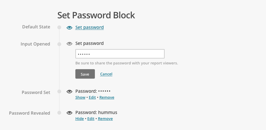
To standardize the way content is shared in the app, the module can be instantiated based on the type of resource being shared. The share module can accommodate combinations of requirements such as implementing password protection, generating shortened links, and referencing a MailChimp account.
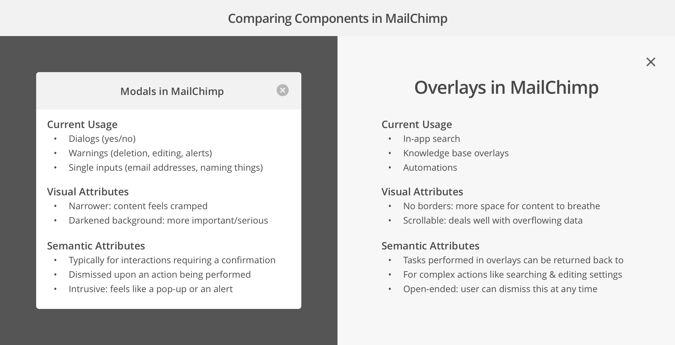
Modular Patterns and Components: Modals v. Overlays
Modular Patterns and Components: Examples

UI Analytics and Measurement
Implementing hypothesis-driven development and understanding the effects of design
Hypothesis-Driven Development
The product design team at MailChimp implements Hypothesis-Driven Development to structure hypotheses and validate conclusions. While analytics attached to UI elements can provide valuable usage data and statistics, design hypotheses can help inform higher-level product decisions.
For example:
We believe that allowing users to customize social cards for links in the share module
Will result in increased engagement when a social media campaign is sent through MailChimp
We will know we have succeeded when the proportion of referrals tracked via link clicks shows more traffic through social media sources
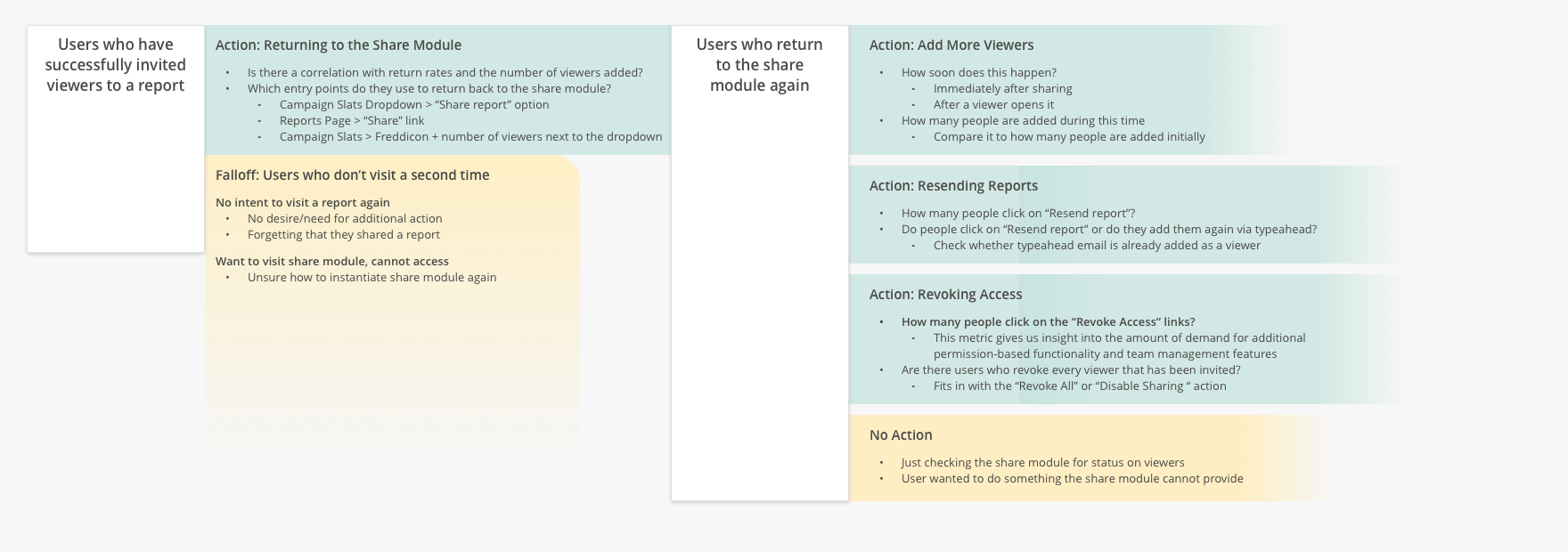
User Flow Analytics
One of the most important parts about design is determining what creates value. To understand how the share module positively impacts our users, I documented the metrics and motives for each step in the sharing process.
User Flow Analytics: Documents

Overall Sharing Experience
Improving every point of interaction related to sharing within MailChimp
Transactional Invitations
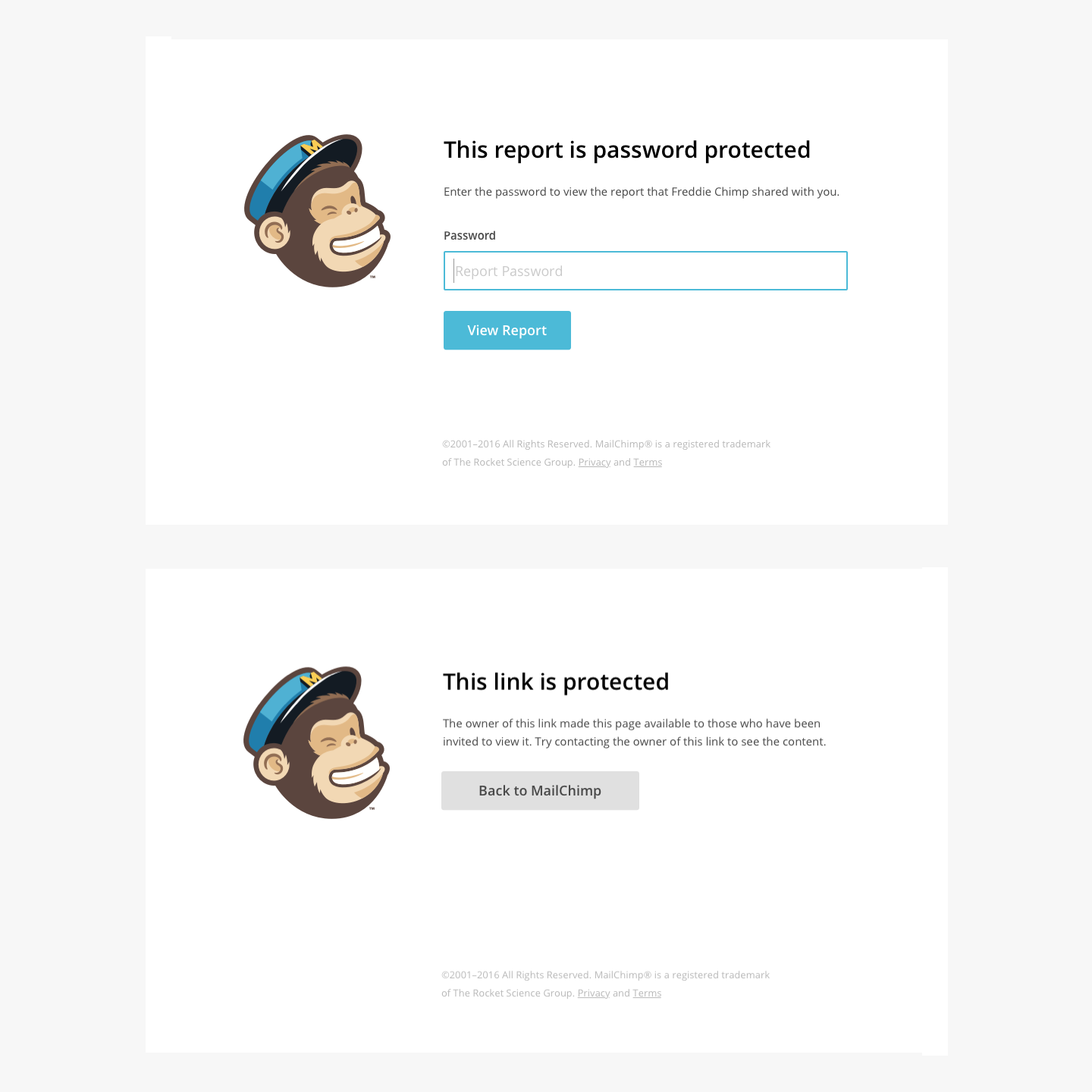
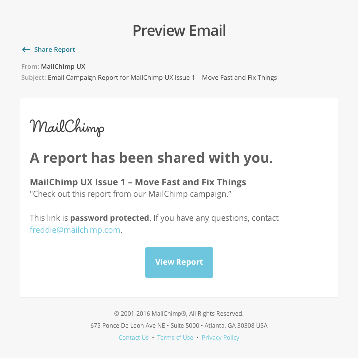
The experience of sharing a report through MailChimp starts once the invitation lands in the recipient’s inbox. We updated our transactional emails and password screens to help MailChimp users look good on their behalf.
Customers and usability testers mentioned they were hesitant to send reports to viewers because they didn't know what they would receive. To fix that, we added a "Preview Email" function that can be viewed before a report is sent.
Transactional Invitations: Comps
Entry Points and Messaging
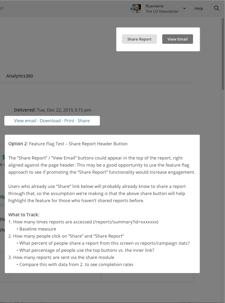
Touchpoints and entry points, in-app marketing to help discoverability. This also required us to collaborate with the marketing teams to identify the conditions (user type, activity) for when things appear.
In line with the UI Analytics and Measurement section above, developers and designers at MailChimp utilize feature flags and experimental populations to gather production data. I worked with several product researchers and designers to find ways to promote sharing content while measuring each method's engagement.
Entry Points and Messaging: Docs

Final Design Comps
Developed and pushed to production
1. Initial Screen
2. Typeahead
3. Filled Out
4. Manage Viewers
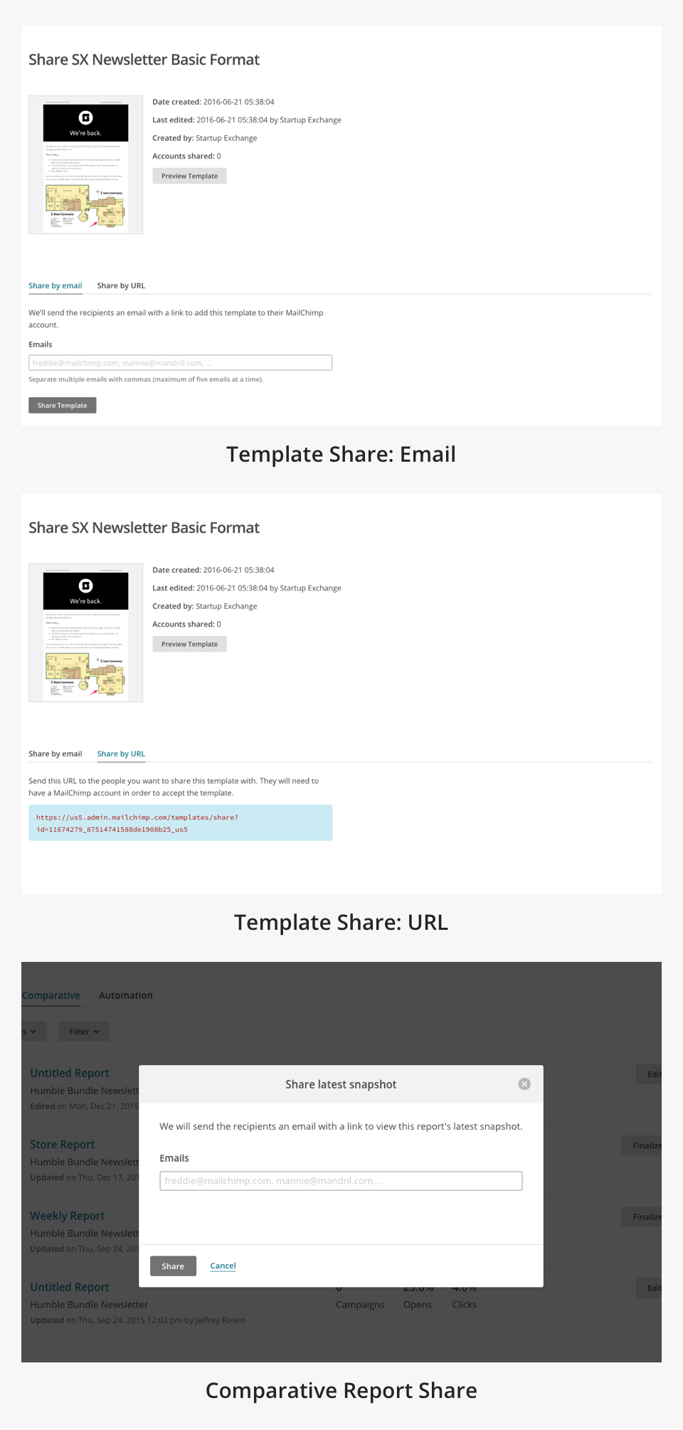
5. Template Share
